
CSS Flexbox Layout
Working with LayoutsIn this lesson, we will learn about the flexbox layout and how to apply it in HTML using CSS.
Introduction to CSS Flexbox
Flexbox, short for Flexible Box, is a one dimensional layout model in CSS that makes it easier to design flexible and responsive web layouts. It was introduced to simplify the way we arrange and distribute elements within a container, especially when dealing with various screen sizes and different content sizes.
Flexbox provides an easy way to control the arrangement of elements within a container. It offers:
- Effortless horizontal and vertical centering of elements.
- The ability to distribute space evenly between elements.
- Automatic adjustment of item sizes to fit the available space.
- The ability to reorder elements without changing the HTML structure.
To start using Flexbox, you need to understand two key concepts:
- Flex Container
- Flex Items

Flex Container
Flex Container is an HTML element to which you apply the display: flex; property in your CSS. This element will serve as the parent container for your flexbox layout in which you add one or more child elements known a Flex Items.
<!doctype html>
<html>

<head>
    <meta charset="utf-8">
    <title>Flexbox Example</title>

    <!-- Internal CSS -->
    <style>
        .container {
            display: flex;
        }
    </style>
</head>

<body>
    <div class="container">
        <!-- Child elements or flex items goes here -->
    </div>
</body>

</html>
Flex Items
The direct child elements of a flex container are referred as Flex Items. The child elements are arranged within the flex container according to the flexbox rules. You don't need to apply any specific properties to child elements to make them flex items. They will automatically become flex items when placed inside a flex container.
<!doctype html>
<html>

<head>
    <meta charset="utf-8">
    <title>Flexbox Example</title>

    <!-- Internal CSS -->
    <style>
        .container {
            display: flex;
        }

        .item {
            width: 80px;
            height: 80px;
            margin: 15px;
            background-color: #60CA00;
            font-size: 50px;
            text-align: center;
            line-height: 80px;
        }
    </style>
</head>

<body>
    <div class="container">
        <div class="item">1</div>    <!-- child element or flex item -->
        <div class="item">2</div>    <!-- child element or flex item -->
        <div class="item">3</div>    <!-- child element or flex item -->
    </div>
</body>

</html>
Flexbox Direction
By default, flex containers arrange their flex items horizontally in left to right direction. However, you can change the direction using the flex-direction property. Here are the possible values:
- row: This is the default value. Flex items are arranged horizontally in left to right direction.
- row-reverse: Flex items are arranged horizontally in reverse order (right to left direction).
- column: Flex Items are arranged vertically in top to bottom direction.
- column-reverse: Flex items are arranged vertically in reverse order (bottom to top direction).
<!doctype html>
<html>

<head>
    <meta charset="utf-8">
    <title>Flexbox Example</title>

    <!-- Internal CSS -->
    <style>
        .container {
            display: flex;
            flex-direction: row;
        }

        .item {
            width: 80px;
            height: 80px;
            margin: 15px;
            background-color: #60CA00;
            font-size: 50px;
            text-align: center;
            line-height: 80px;
        }
    </style>
</head>

<body>
    <div class="container">
        <div class="item">1</div>
        <div class="item">2</div>
        <div class="item">3</div>
    </div>
</body>

</html>
Flexbox Alignment
Flexbox provides powerful alignment options. You can control how items align both horizontally and vertically within the container using properties like justify-content, align-items and align-self.
justify-content
The justify-content property is used to control the position of flex items along the main axis (horizontal for row, vertical for column). The possible values of justify-content property are:
- flex-start: This is the default value. Flex items are aligned to the start of the container.
- flex-end: Flex items are aligned to the end of the container.
- center: Flex items are aligned horizontally center of the container.
- space-between: Flex items are evenly distributed with space in between.
- space-around: Flex items are evenly distributed with space around them.
<!doctype html>
<html>

<head>
    <meta charset="utf-8">
    <title>Flexbox Example</title>

    <!-- Internal CSS -->
    <style>
        .container {
        	height: 300px;
        	border: 2px dashed black;
            display: flex;
            flex-direction: row;
            justify-content: flex-start;
        }

        .item {
            width: 80px;
            height: 80px;
            margin: 15px;
            background-color: #60CA00;
            font-size: 50px;
            text-align: center;
            line-height: 80px;
        }
    </style>
</head>

<body>
    <div class="container">
        <div class="item">1</div>
        <div class="item">2</div>
        <div class="item">3</div>
    </div>
</body>

</html>
align-items
The align-items property controls how items are aligned along the cross axis (vertical axis). The possible values of align-items property are:
- stretch: This is the default value. Flex items stretch itself to fill the container vertically.
- flex-start: Flex items are aligned to the start of the container vertically.
- flex-end: Flex items are aligned to the end of the container vertically.
- center: Flex items are aligned vertically center of the container.
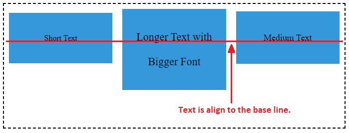
- baseline: It aligns flex items such that their baselines (text baselines) are aligned. This can be useful when dealing with items of different heights, like text with varying font sizes. See the image given below.
<!doctype html>
<html>

<head>
    <meta charset="utf-8">
    <title>Flexbox Example</title>

    <!-- Internal CSS -->
    <style>
        .container {
        	height: 300px;
        	border: 2px dashed black;
            display: flex;
            flex-direction: row;
            justify-content: flex-start;
            align-items: stretch;
        }

        .item {
            width: 80px;
            margin: 15px;
            background-color: #60CA00;
            font-size: 50px;
            text-align: center;
            line-height: 80px;
        }
    </style>
</head>

<body>
    <div class="container">
        <div class="item">1</div>
        <div class="item">2</div>
        <div class="item">3</div>
    </div>
</body>

</html>
align-self
The align-self property in CSS Flexbox is used to control the alignment of individual flex items within a flex container. It allows you to customize the vertical alignment of a specific item, which can be different from the alignment applied to other items in the same container. This property is particularly useful when you need to fine-tune the alignment of individual items within a flex layout.
The possible values of align-self property include stretch, flex-start, flex-end and center.
<!doctype html>
<html>

<head>
    <meta charset="utf-8">
    <title>Flexbox Example</title>

    <!-- Internal CSS -->
    <style>
        .container {
        	height: 300px;
        	border: 2px dashed black;
            display: flex;
            flex-direction: row;
            justify-content: flex-start;
            align-items: stretch;
        }

        .item {
            width: 80px;
            margin: 15px;
            background-color: #60CA00;
            font-size: 50px;
            text-align: center;
            line-height: 80px;
        }
    </style>
</head>

<body>
    <div class="container">
        <div class="item" style="align-self: stretch">1</div>
        <div class="item" style="align-self: flex-start">2</div>
        <div class="item" style="align-self: flex-end">3</div>
        <div class="item" style="align-self: center">4</div>
    </div>
</body>

</html>
Flexbox Wrapping
The flex-wrap property is used in CSS Flexbox to control how flex items behave when they don't fit within the main axis of the flex container. It determines whether the flex items should wrap onto a new line or stay on the same line. The possible values of flex-wrap property are:
- nowrap: This is the default value. It indicates that all flex items should remain on a single line, even if they overflow the available space along the main axis. In other words, items won't wrap to the next line.
- wrap: Flex items will wrap onto a new line if they don't fit within the available space on the main axis.
- wrap-reverse: Flex items will wrap to a new line if they don't fit within the available space, but the wrapping starts from the opposite end of the container.
<!doctype html>
<html>

<head>
    <meta charset="utf-8">
    <title>Flexbox Example</title>

    <!-- Internal CSS -->
    <style>
        .container {
        	border: 2px dashed black;
            display: flex;
            flex-direction: row;
            flex-wrap: nowrap;
        }

        .item {
            width: 80px;
            height: 80px;
            margin: 15px;
            background-color: #60CA00;
            font-size: 50px;
            text-align: center;
            line-height: 80px;
        }
    </style>
</head>

<body>
    <div class="container">
        <div class="item">1</div>
        <div class="item">2</div>
        <div class="item">3</div>
        <div class="item">4</div>
        <div class="item">5</div>
        <div class="item">6</div>
        <div class="item">7</div>
        <div class="item">8</div>
        <div class="item">9</div>
        <div class="item">10</div>
        <div class="item">11</div>
        <div class="item">12</div>
        <div class="item">13</div>
        <div class="item">14</div>
        <div class="item">15</div>
        <div class="item">16</div>
        <div class="item">17</div>
        <div class="item">18</div>
        <div class="item">19</div>
        <div class="item">20</div>
    </div>
</body>

</html>
Flex Items Flexibility
The flex property in CSS Flexbox is a shorthand property that combines three individual properties: flex-grow, flex-shrink, and flex-basis. It allows you to control how flex items expand and shrink to occupy available space within a flex container.
- flex-grow: This property determines how much an item can grow relative to other items when there is an extra space available within the flex container. It takes a non-negative value.
- flex-shrink: This property controls how much an item can shrink relative to other items when there is not enough space to accommodate all items. It also take a non-negative value.
- flex-basis: This property specifies the initial size of the item before any growing or shrinking occurs. It can be set in pixels, percentages, or other length units.
<!doctype html>
<html>

<head>
    <meta charset="utf-8">
    <title>Flexbox Example</title>

    <!-- Internal CSS -->
    <style>
        .container {
        	border: 2px dashed black;
            display: flex;
            flex-direction: row;
            flex-wrap: wrap;
            justify-content: space-between;
        }

        .item {
            flex-grow: 1;
            flex-shrink: 0;
            flex-basis: 200px;
            margin: 15px;
            background-color: #60CA00;
            font-size: 50px;
            text-align: center;
            line-height: 80px;
        }
    </style>
</head>

<body>
    <div class="container">
        <div class="item">1</div>
        <div class="item">2</div>
        <div class="item">3</div>
        <div class="item">4</div>
        <div class="item">5</div>
    </div>
</body>

</html>
In the above example, we have a flex container with five flex items. We set the flex-grow to 1 that means each item can grow equally if there is any extra space available, flex-shrink to 0 that means each item won't shrink beyond its initial size, flex-basis to 200px that means initial size of each item is set to 200 pixels.
Flex Items Order
The order property in CSS Flexbox is used to control the visual order of flex items within a flex container. It allows you to change the order in which items are displayed on the screen without changing their position in the HTML source code. This is particularly useful for creating flexible and responsive layouts where you need to rearrange elements based on different screen sizes or other criteria.
<!doctype html>
<html>

<head>
    <meta charset="utf-8">
    <title>Flexbox Example</title>

    <!-- Internal CSS -->
    <style>
        .container {
        	border: 2px dashed black;
            display: flex;
            flex-direction: row;
        }

        .item {
            width: 80px;
            height: 80px;
            margin: 15px;
            background-color: #60CA00;
            font-size: 50px;
            text-align: center;
            line-height: 80px;
        }
    </style>
</head>

<body>
    <div class="container">
        <div class="item" style="order: 2">1</div>
        <div class="item" style="order: 3">2</div>
        <div class="item" style="order: 1">3</div>
    </div>
</body>

</html>