Understanding CSS Gradient
Gradient, Shadow and Filter
In this lesson, we will learn about CSS gradient, its main types and how to use it in CSS.
CSS Gradient
The CSS gradient allows you to create smooth color transitions on your web pages. Think of it as a way to blend colors together, just like mixing paint on a canvas.
There are two main types of gradients in CSS and they are:
Linear Gradient Radial Gradient
Linear Gradient
The Linear gradient is used to create a smooth transition between colors in a straight line.
Imagine you have a straight line, like a road. Now, let's say you want to paint this road with two colors, like going from blue to green. The linear-gradient function helps you achieve this effect.
Syntax
background: linear-gradient(direction, color-stop1 position, color-stop2 position, ...);
In the above syntax, the direction specifies the direction or angle of the gradient. It can be values like to right , to left , or even in degrees like 45deg .
color-stop1 position , color-stop2 position , and so on represent the colors that you want to mix and positions in percent or length (like pixels) represents the amount till which the colors will spread. You can use color names, HEX codes, or RGB values. The color's position values are optional.
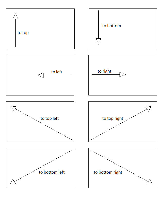
The list of values that can be used in direction are:
to top : It means move towards top (starting from bottom to top).to bottom : It means move towards bottom (starting from top to bottom). It is the default position.to left : It means move towards left (starting from right to left).to right : It means move towards right (starting from left to right).to top left : It means move towards top left corner (starting from bottom right corner to top left corner).to top right : It means move towards top right corner (starting from bottom left corner to top right corner).to bottom left : It means move towards bottom left corner (starting from top right corner to bottom left corner).to bottom right : It means move towards bottom right corner (starting from top left corner to bottom right corner).
Radial Gradient
The Radial Gradient is used to create a smooth transition between colors in a circular or radial pattern.
Now, let's think of a radial gradient as if you were dropping paint on a piece of paper and watching it spread from a central point. This is exactly what radial-gradient does in CSS.
Syntax
background: radial-gradient(shape size at position, color-stop1 position, color-stop2 position, ...);
In the above syntax, the shape determines the shape of the gradient, like:
The size defines the size of the gradient shape, like:
closest-side closest-corner farthest-side farthest-corner
The at position specifies the position of the gradient's center. The position can be in written terms of x and y coordinates in form of percent, pixel, or position names like:
at 80% 30% at 50px 80px at top left at top right at bottom left at bottom right at top center at bottom center at left center at right center at center center
The rest of the values are same as you have seen in the liner-gradient function.
© 2026 Dremendo. All Rights Reserved.
Do you like cookies? 🍪 We use cookies to ensure you get the best experience on our website.
Learn more
I agree
<!doctype html>
<html>

<head>
    <meta charset="utf-8">
    <title>CSS Linear Gradient Example</title>

    <!-- Internal CSS -->
    <style>
        .gradient-box {
            width: 250px;
            height: 180px;
            background: linear-gradient(to top, yellow 40%, red 60%);
        }
    </style>
</head>

<body>
    <div class="gradient-box"></div>
</body>

</html> <!doctype html>
<html>
<head>
<meta charset="utf-8">
<title>CSS Linear Gradient Example</title>
<!-- Internal CSS -->
<style>
.gradient-box {
width: 250px;
height: 180px;
background: linear-gradient(to bottom, yellow 40%, red 60%);
}
</style>
</head>
<body>
<div class="gradient-box"></div>
</body>
</html> <!doctype html>
<html>
<head>
<meta charset="utf-8">
<title>CSS Linear Gradient Example</title>
<!-- Internal CSS -->
<style>
.gradient-box {
width: 250px;
height: 180px;
background: linear-gradient(to left, yellow 40%, red 60%);
}
</style>
</head>
<body>
<div class="gradient-box"></div>
</body>
</html> <!doctype html>
<html>
<head>
<meta charset="utf-8">
<title>CSS Linear Gradient Example</title>
<!-- Internal CSS -->
<style>
.gradient-box {
width: 250px;
height: 180px;
background: linear-gradient(to right, yellow 40%, red 60%);
}
</style>
</head>
<body>
<div class="gradient-box"></div>
</body>
</html> <!doctype html>
<html>
<head>
<meta charset="utf-8">
<title>CSS Linear Gradient Example</title>
<!-- Internal CSS -->
<style>
.gradient-box {
width: 250px;
height: 180px;
background: linear-gradient(to top left, yellow 40%, red 60%);
}
</style>
</head>
<body>
<div class="gradient-box"></div>
</body>
</html> <!doctype html>
<html>
<head>
<meta charset="utf-8">
<title>CSS Linear Gradient Example</title>
<!-- Internal CSS -->
<style>
.gradient-box {
width: 250px;
height: 180px;
background: linear-gradient(to top right, yellow 40%, red 60%);
}
</style>
</head>
<body>
<div class="gradient-box"></div>
</body>
</html> <!doctype html>
<html>
<head>
<meta charset="utf-8">
<title>CSS Linear Gradient Example</title>
<!-- Internal CSS -->
<style>
.gradient-box {
width: 250px;
height: 180px;
background: linear-gradient(to bottom left, yellow 40%, red 60%);
}
</style>
</head>
<body>
<div class="gradient-box"></div>
</body>
</html> <!doctype html>
<html>
<head>
<meta charset="utf-8">
<title>CSS Linear Gradient Example</title>
<!-- Internal CSS -->
<style>
.gradient-box {
width: 250px;
height: 180px;
background: linear-gradient(to bottom right, yellow 40%, red 60%);
}
</style>
</head>
<body>
<div class="gradient-box"></div>
</body>
</html> <!doctype html>
<html>
<head>
<meta charset="utf-8">
<title>CSS Linear Gradient Example</title>
<!-- Internal CSS -->
<style>
.gradient-box {
width: 250px;
height: 180px;
background: linear-gradient(20deg, yellow 40%, red 60%);
}
</style>
</head>
<body>
<div class="gradient-box"></div>
</body>
</html> <!doctype html>
<html>
<head>
<meta charset="utf-8">
<title>CSS Linear Gradient Example</title>
<!-- Internal CSS -->
<style>
.gradient-box {
width: 250px;
height: 180px;
background: linear-gradient(to bottom left, yellow, red, orange, blue, cyan, green);
}
</style>
</head>
<body>
<div class="gradient-box"></div>
</body>
</html> <!doctype html>
<html>
<head>
<meta charset="utf-8">
<title>CSS Repeating Linear Gradient Example</title>
<!-- Internal CSS -->
<style>
.gradient-box {
width: 250px;
height: 180px;
background: repeating-linear-gradient(to right, yellow 40%, red 60%);
}
</style>
</head>
<body>
<div class="gradient-box"></div>
</body>
</html>
<!doctype html>
<html>

<head>
    <meta charset="utf-8">
    <title>CSS Radial Gradient Example</title>

    <!-- Internal CSS -->
    <style>
        .gradient-box {
            width: 250px;
            height: 180px;
            background: radial-gradient(circle, yellow 40%, red 60%);
        }
    </style>
</head>

<body>
    <div class="gradient-box"></div>
</body>

</html> <!doctype html>
<html>
<head>
<meta charset="utf-8">
<title>CSS Radial Gradient Example</title>
<!-- Internal CSS -->
<style>
.gradient-box {
width: 250px;
height: 180px;
background: radial-gradient(ellipse, yellow 40%, red 60%);
}
</style>
</head>
<body>
<div class="gradient-box"></div>
</body>
</html> <!doctype html>
<html>
<head>
<meta charset="utf-8">
<title>CSS Radial Gradient Example</title>
<!-- Internal CSS -->
<style>
.gradient-box {
width: 250px;
height: 180px;
background: radial-gradient(circle closest-side, yellow 40%, red 60%);
}
</style>
</head>
<body>
<div class="gradient-box"></div>
</body>
</html> <!doctype html>
<html>
<head>
<meta charset="utf-8">
<title>CSS Radial Gradient Example</title>
<!-- Internal CSS -->
<style>
.gradient-box {
width: 250px;
height: 180px;
background: radial-gradient(circle closest-corner, yellow 40%, red 60%);
}
</style>
</head>
<body>
<div class="gradient-box"></div>
</body>
</html> <!doctype html>
<html>
<head>
<meta charset="utf-8">
<title>CSS Radial Gradient Example</title>
<!-- Internal CSS -->
<style>
.gradient-box {
width: 250px;
height: 180px;
background: radial-gradient(circle farthest-side, yellow 40%, red 60%);
}
</style>
</head>
<body>
<div class="gradient-box"></div>
</body>
</html> <!doctype html>
<html>
<head>
<meta charset="utf-8">
<title>CSS Radial Gradient Example</title>
<!-- Internal CSS -->
<style>
.gradient-box {
width: 250px;
height: 180px;
background: radial-gradient(circle farthest-corner, yellow 40%, red 60%);
}
</style>
</head>
<body>
<div class="gradient-box"></div>
</body>
</html> <!doctype html>
<html>
<head>
<meta charset="utf-8">
<title>CSS Radial Gradient Example</title>
<!-- Internal CSS -->
<style>
.gradient-box {
width: 250px;
height: 180px;
background: radial-gradient(circle farthest-side at 80% 30%, yellow 40%, red 60%);
}
</style>
</head>
<body>
<div class="gradient-box"></div>
</body>
</html> <!doctype html>
<html>
<head>
<meta charset="utf-8">
<title>CSS Radial Gradient Example</title>
<!-- Internal CSS -->
<style>
.gradient-box {
width: 250px;
height: 180px;
background: radial-gradient(circle farthest-side at 50px 80px, yellow 40%, red 60%);
}
</style>
</head>
<body>
<div class="gradient-box"></div>
</body>
</html> <!doctype html>
<html>
<head>
<meta charset="utf-8">
<title>CSS Radial Gradient Example</title>
<!-- Internal CSS -->
<style>
.gradient-box {
width: 250px;
height: 180px;
background: radial-gradient(circle farthest-side at top left, yellow 40%, red 60%);
}
</style>
</head>
<body>
<div class="gradient-box"></div>
</body>
</html> <!doctype html>
<html>
<head>
<meta charset="utf-8">
<title>CSS Radial Gradient Example</title>
<!-- Internal CSS -->
<style>
.gradient-box {
width: 250px;
height: 180px;
background: radial-gradient(circle farthest-side at top right, yellow 40%, red 60%);
}
</style>
</head>
<body>
<div class="gradient-box"></div>
</body>
</html> <!doctype html>
<html>
<head>
<meta charset="utf-8">
<title>CSS Radial Gradient Example</title>
<!-- Internal CSS -->
<style>
.gradient-box {
width: 250px;
height: 180px;
background: radial-gradient(circle farthest-side at bottom left, yellow 40%, red 60%);
}
</style>
</head>
<body>
<div class="gradient-box"></div>
</body>
</html> <!doctype html>
<html>
<head>
<meta charset="utf-8">
<title>CSS Radial Gradient Example</title>
<!-- Internal CSS -->
<style>
.gradient-box {
width: 250px;
height: 180px;
background: radial-gradient(circle farthest-side at bottom right, yellow 40%, red 60%);
}
</style>
</head>
<body>
<div class="gradient-box"></div>
</body>
</html> <!doctype html>
<html>
<head>
<meta charset="utf-8">
<title>CSS Radial Gradient Example</title>
<!-- Internal CSS -->
<style>
.gradient-box {
width: 250px;
height: 180px;
background: radial-gradient(circle farthest-side at top center, yellow 40%, red 60%);
}
</style>
</head>
<body>
<div class="gradient-box"></div>
</body>
</html> <!doctype html>
<html>
<head>
<meta charset="utf-8">
<title>CSS Radial Gradient Example</title>
<!-- Internal CSS -->
<style>
.gradient-box {
width: 250px;
height: 180px;
background: radial-gradient(circle farthest-side at bottom center, yellow 40%, red 60%);
}
</style>
</head>
<body>
<div class="gradient-box"></div>
</body>
</html> <!doctype html>
<html>
<head>
<meta charset="utf-8">
<title>CSS Radial Gradient Example</title>
<!-- Internal CSS -->
<style>
.gradient-box {
width: 250px;
height: 180px;
background: radial-gradient(circle farthest-side at left center, yellow 40%, red 60%);
}
</style>
</head>
<body>
<div class="gradient-box"></div>
</body>
</html> <!doctype html>
<html>
<head>
<meta charset="utf-8">
<title>CSS Radial Gradient Example</title>
<!-- Internal CSS -->
<style>
.gradient-box {
width: 250px;
height: 180px;
background: radial-gradient(circle farthest-side at right center, yellow 40%, red 60%);
}
</style>
</head>
<body>
<div class="gradient-box"></div>
</body>
</html> <!doctype html>
<html>
<head>
<meta charset="utf-8">
<title>CSS Radial Gradient Example</title>
<!-- Internal CSS -->
<style>
.gradient-box {
width: 250px;
height: 180px;
background: radial-gradient(circle farthest-side at center center, yellow 40%, red 60%);
}
</style>
</head>
<body>
<div class="gradient-box"></div>
</body>
</html> <!doctype html>
<html>
<head>
<meta charset="utf-8">
<title>CSS Radial Gradient Example</title>
<!-- Internal CSS -->
<style>
.gradient-box {
width: 250px;
height: 180px;
background: radial-gradient(circle, yellow, red, orange, blue, cyan, green);
}
</style>
</head>
<body>
<div class="gradient-box"></div>
</body>
</html> <!doctype html>
<html>
<head>
<meta charset="utf-8">
<title>CSS Repeating Radial Gradient Example</title>
<!-- Internal CSS -->
<style>
.gradient-box {
width: 250px;
height: 180px;
background: repeating-radial-gradient(circle farthest-side at center center, yellow 40%, red 60%);
}
</style>
</head>
<body>
<div class="gradient-box"></div>
</body>
</html>

