
CSS Grid Layout
Working with LayoutsIn this lesson, we will learn about the grid layout and how to apply it in HTML using CSS.
Introduction to CSS Grid
In CSS, a Grid typically refers to the CSS Grid Layout, which is a two-dimensional layout system used to design web pages in a grid structure. CSS Grid allows you to create complex and responsive layouts by dividing the available space into rows and columns.
To start using Grid layout, you need to understand the following key concepts:
- Grid Container
- Grid Items
- Rows and Columns
- Grid Lines and Tracks
- Grid Gap
- Positioning Grid Items
- Grid Flow Direction
- Grid Alignment

Grid Container
Grid Container is an HTML element to which you apply the display: grid; property in your CSS. This element will serve as the parent container for your grid layout in which you add one or more grid items.
<!doctype html>
<html>

<head>
    <meta charset="utf-8">
    <title>Grid Example</title>

    <!-- Internal CSS -->
    <style>
        .container {
            display: grid;
        }
    </style>
</head>

<body>
    <div class="container">
        <!-- grid items goes here -->
    </div>
</body>

</html>
Grid Items
Grid items are regular HTML elements like <div>, <p>, or any other element that you want to place within the grid container. You can place multiple items within a grid container, and they will be automatically positioned based on the grid's structure.
<!doctype html>
<html>

<head>
    <meta charset="utf-8">
    <title>Grid Example</title>

    <!-- Internal CSS -->
    <style>
        .container {
            display: grid;
        }

        .item {
            width: 80px;
            height: 80px;
            margin: 15px;
            background-color: #60CA00;
            font-size: 50px;
            text-align: center;
            line-height: 80px;
        }
    </style>
</head>

<body>
    <div class="container">
        <div class="item">1</div>
        <div class="item">2</div>
        <div class="item">3</div>
        <!-- Add more grid items as needed -->
    </div>
</body>

</html>
Rows and Columns
Rows and Columns define the structure of a grid layout by specifying the number and size of rows and columns within a grid container. Here's an explanation with examples:
Defining Grid Rows
You can define the structure of grid rows using the grid-template-rows property. This property allows you to specify the number of rows and their sizes. You can use various units like px (pixels), % (percentages), auto, min-content, max-content or fr (fractions) to define row sizes.
<!doctype html>
<html>

<head>
    <meta charset="utf-8">
    <title>Grid Example</title>

    <!-- Internal CSS -->
    <style>
        .container {
            display: grid;
            grid-template-rows: 1fr 2fr 1fr;
        }

        .item {
            width: 80px;
            height: 80px;
            margin: 15px;
            background-color: #60CA00;
            font-size: 50px;
            text-align: center;
            line-height: 80px;
        }
    </style>
</head>

<body>
    <div class="container">
        <div class="item">1</div>
        <div class="item">2</div>
        <div class="item">3</div>
        <!-- Add more grid items as needed -->
    </div>
</body>

</html>
When you use 1fr, it signifies that the row takes up one fraction of the available space. If there are multiple rows with 1fr, they share the available space equally.
In the above example, the grid container has three rows, and their sizes are defined using 1fr, 2fr, and 1fr. This means the middle row takes up twice as much space as the other two rows.
The fr unit is particularly useful for creating responsive and dynamic layouts.
Defining Grid Columns
You can define the structure of grid columns using the grid-template-columns property. It allows you to specify the number of columns and their sizes. You can use various units like px (pixels), % (percentages), auto, min-content, max-content or fr (fractions) to define row sizes.
<!doctype html>
<html>

<head>
    <meta charset="utf-8">
    <title>Grid Example</title>

    <!-- Internal CSS -->
    <style>
        .container {
            display: grid;
            grid-template-columns: repeat(4, 1fr); /* Four columns with equal width */;
        }

        .item {
            width: 80px;
            height: 80px;
            margin: 15px;
            background-color: #60CA00;
            font-size: 50px;
            text-align: center;
            line-height: 80px;
        }
    </style>
</head>

<body>
    <div class="container">
        <div class="item">1</div>
        <div class="item">2</div>
        <div class="item">3</div>
        <div class="item">4</div>
        <!-- Add more grid items as needed -->
    </div>
</body>

</html>
In the above example, we have defined a grid container with four columns, each of which takes up an equal fraction of the available space.
Combining Rows and Columns
You can combine row and column definitions to create a grid with both rows and columns.
<!doctype html>
<html>

<head>
    <meta charset="utf-8">
    <title>Grid Example</title>

    <!-- Internal CSS -->
    <style>
        .container {
            display: grid;
            grid-template-rows: 200px 1fr 2fr;
            grid-template-columns: repeat(4, 1fr);
        }

        .item {
            width: 80px;
            height: 80px;
            margin: 15px;
            background-color: #60CA00;
            font-size: 50px;
            text-align: center;
            line-height: 80px;
        }
    </style>
</head>

<body>
    <div class="container">
        <div class="item">1</div>
        <div class="item">2</div>
        <div class="item">3</div>
        <div class="item">4</div>
        <div class="item">5</div>
        <div class="item">6</div>
        <div class="item">7</div>
        <div class="item">8</div>
        <div class="item">9</div>
        <div class="item">10</div>
        <!-- Add more grid items as needed -->
    </div>
</body>

</html>
repeat() Function
The repeat() function in CSS is used to specify a repeating pattern of columns or rows in a grid layout. It's a convenient way to define the structure of a grid by specifying the number of repetitions and the size of each repetition.
grid-template-columns: repeat(number_of_repetitions, size_of_each_repetition);
grid-template-rows: repeat(number_of_repetitions, size_of_each_repetition);- number_of_repetitions: This is the number of times the specified size should be repeated.
- size_of_each_repetition: This defines the size of each repetition, which can be specified using various length units such as px, %, fr, min-content, max-content or auto.
Here are some examples of how the repeat() function can be used in CSS Grid Layout:
Repeating Columns with Equal Width
To create a grid with three equally sized columns, you can use repeat() like this:
grid-template-columns: repeat(3, 1fr);Repeating Columns with Fixed Width
If you want to repeat columns with a fixed width, you can specify the size using pixels, like this:
grid-template-columns: repeat(4, 100px);Combining Repeat and Auto
You can combine repeat() with auto to create a grid with a fixed-size column followed by auto-sized columns. For example:
grid-template-columns: 200px repeat(3, auto);In the example above, the first column is 200 pixels wide, and the rest 3 columns are auto-sized, adjusting to their content.
Repeating Rows with Percentages
To create a grid with three rows, each taking 30% of the available space, you can use:
grid-template-rows: repeat(3, 30%);Repeating Columns with max-content
To create a grid with three columns that can dynamically adjust itself based on the content within it, you can use:
grid-template-columns: repeat(3, max-content);Grid Lines and Tracks
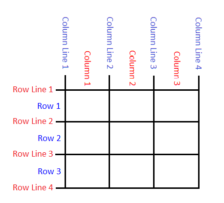
Grid lines are imaginary lines that form a grid in both the horizontal and vertical directions. Horizontal grid lines run from left to right, while vertical grid lines run from top to bottom.
Grid lines are indexed numerically, starting from 1. The line at the very start of the grid is 1, and each subsequent line is counted from there. The horizontal lines are numbered from left to right, and the vertical lines are numbered from top to bottom.
Grid tracks are the spaces between the grid lines, forming rows and columns. Rows are created between horizontal lines, while columns are created between vertical lines.
Grid Gap
The grid-gap property is used to define the spacing, or gap, between grid items and grid tracks (rows and columns) within a grid container. It allows you to control the space between items to create well-organized and visually pleasing layouts.
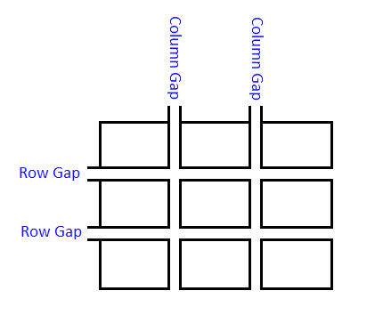
Setting Different Row and Column Gaps
.grid-container {
    display: grid;
    grid-gap: 10px 20px;    /* 10px gap between rows and 20px gap between columns */
}
Setting the Same Gap for Rows and Columns
.grid-container {
    display: grid;
    grid-gap: 15px;     /* 15px gap for both rows and columns */
}<!doctype html>
<html>
<head>
<meta charset="utf-8">
<title>Grid Example</title>
<!-- Internal CSS -->
<style>
.container {
display: grid;
grid-template-columns: repeat(4, 80px);
grid-gap: 10px 20px;
}
.item {
width: 80px;
height: 80px;
background-color: #60CA00;
font-size: 50px;
text-align: center;
line-height: 80px;
}
</style>
</head>
<body>
<div class="container">
<div class="item">1</div>
<div class="item">2</div>
<div class="item">3</div>
<div class="item">4</div>
<div class="item">5</div>
<div class="item">6</div>
<div class="item">7</div>
<div class="item">8</div>
<div class="item">9</div>
<div class="item">10</div>
<!-- Add more grid items as needed -->
</div>
</body>
</html>Positioning Grid Items
Positioning grid items within a CSS Grid Layout is a crucial aspect of creating the desired layout for your web page. You can control the placement of grid items using various CSS properties. Let's explore how to position grid items:
Row and Column Line Placement
You can specify where a grid item is placed in terms of grid lines by using the grid-row and grid-column properties.
grid-row: start / end;     /* This property specifies which rows the grid item occupies. */
grid-column: start / end; /* This property specifies which columns the grid item occupies. */<!doctype html>
<html>
<head>
<meta charset="utf-8">
<title>Grid Example</title>
<!-- Internal CSS -->
<style>
.container {
display: grid;
grid-template-columns: repeat(4, 80px);
grid-gap: 5px;
}
.item {
background-color: #60CA00;
font-size: 50px;
text-align: center;
line-height: 80px;
}
.item-2 {
grid-row: 1 / 3; /* start from row line 2 and end on row line 3 */
grid-column: 2 / 4; /* start from column line 2 and end on column line 4 */
}
</style>
</head>
<body>
<div class="container">
<div class="item">1</div>
<div class="item item-2">2</div>
<div class="item">3</div>
<div class="item">4</div>
<div class="item">5</div>
<div class="item">6</div>
<div class="item">7</div>
<div class="item">8</div>
<div class="item">9</div>
<div class="item">10</div>
<div class="item">11</div>
<div class="item">12</div>
</div>
</body>
</html>In the example above, the grid item item-2 is placed from row line 1 to row line 3 and column line 2 to column line 4.
Spanning Multiple Rows and Columns
You can use the span keyword to make the grid item span multiple rows or columns.
<!doctype html>
<html>

<head>
    <meta charset="utf-8">
    <title>Grid Example</title>

    <!-- Internal CSS -->
    <style>
        .container {
            display: grid;
            grid-template-columns: repeat(4, 80px);
            grid-gap: 10px;
        }

        .item {
            background-color: #60CA00;
            font-size: 50px;
            text-align: center;
            line-height: 80px;
        }

        .item-6 {
        	grid-row: 2 / span 2;   /* start from row line 2 and span 2 rows */
        	grid-column: 2 / span 3;    /* start from column line 2 and span 3 columns */
        }
    </style>
</head>

<body>
    <div class="container">
        <div class="item">1</div>
        <div class="item">2</div>
        <div class="item">3</div>
        <div class="item">4</div>
        <div class="item">5</div>
        <div class="item item-6">6</div>
        <div class="item">7</div>
        <div class="item">8</div>
        <div class="item">9</div>
        <div class="item">10</div>
        <div class="item">11</div>
        <div class="item">12</div>
    </div>
</body>

</html>
In the example above, the grid item item-6 is placed at row line 2 and span 2 rows and column line 2 and span 3 columns.
Placing Grid Items using grid-area Property
The grid-area property in CSS Grid Layout is used to specify both the row and column positions for a grid item, as well as its span across rows and columns. It simplifies the placement of grid items by allowing you to define all of these aspects in a single property.
grid-area: row-start / column-start / row-end / column-end;row-start and row-end define the starting and ending rows for the grid item. column-start and column-end define the starting and ending columns for the grid item.
<!doctype html>
<html>

<head>
    <meta charset="utf-8">
    <title>Grid Example</title>

    <!-- Internal CSS -->
    <style>
        .container {
            display: grid;
            grid-template-columns: repeat(4, 80px);
            grid-gap: 10px;
        }

        .item {
            background-color: #60CA00;
            font-size: 50px;
            text-align: center;
            line-height: 80px;
        }

        .item-2 {
        	grid-area: 1 / 2 / 6 / 4;	/* start from row line 1 and column line 2 and ends on row line 6 and column line 4 */
        }
    </style>
</head>

<body>
    <div class="container">
        <div class="item">1</div>
        <div class="item item-2">2</div>
        <div class="item">3</div>
        <div class="item">4</div>
        <div class="item">5</div>
        <div class="item">6</div>
        <div class="item">7</div>
        <div class="item">8</div>
        <div class="item">9</div>
        <div class="item">10</div>
        <div class="item">11</div>
    </div>
</body>

</html>
You can also use span to make the grid item span multiple rows or columns.
<!doctype html>
<html>

<head>
    <meta charset="utf-8">
    <title>Grid Example</title>

    <!-- Internal CSS -->
    <style>
        .container {
            display: grid;
            grid-template-columns: repeat(4, 80px);
            grid-gap: 10px;
        }

        .item {
            background-color: #60CA00;
            font-size: 50px;
            text-align: center;
            line-height: 80px;
        }

        .item-2 {
        	grid-area: 1 / 2 / span 5 / span 2; /* start from row line 1 and column line 2 and span 5 rows and 2 columns */
        }
    </style>
</head>

<body>
    <div class="container">
        <div class="item">1</div>
        <div class="item item-2">2</div>
        <div class="item">3</div>
        <div class="item">4</div>
        <div class="item">5</div>
        <div class="item">6</div>
        <div class="item">7</div>
        <div class="item">8</div>
        <div class="item">9</div>
        <div class="item">10</div>
        <div class="item">11</div>
    </div>
</body>

</html>
Placing Grid Items using grid-template-areas Property
The grid-template-areas property in CSS Grid Layout allows you to define the layout of a grid using named grid areas. This feature is especially useful for creating complex and visually organized grid structures. You can use a grid template to visually represent your layout by assigning names to specific areas and then place grid items in these areas.
grid-template-areas:
    "area1 area2 area3"
    "area4 area5 area6"
"area7 area8 area9";- Each line within the property defines a grid row.
- The names within double quotation marks represent the grid areas, and you can use any name you like.
- The layout is represented as a grid with areas in the specified arrangement.
<!doctype html>
<html>

<head>
    <meta charset="utf-8">
    <title>Grid Example</title>

    <!-- Internal CSS -->
    <style>
        .container {
            display: grid;
            grid-template-areas:
            	"header header header"
            	"sidebar main main"
            	"footer footer footer";
            grid-gap: 10px;
        }

        .container div {
            background-color: #60CA00;
            font-size: 50px;
            text-align: center;
            line-height: 80px;
        }

        .item1 {
        	grid-area: header;
        }

        .item2 {
        	grid-area: sidebar;
        }

        .item3 {
        	grid-area: main;
        }

        .item4 {
        	grid-area: footer;
        }
    </style>
</head>

<body>
    <div class="container">
        <div class="item1">Header</div>
        <div class="item2">Sidebar</div>
        <div class="item3">Main</div>
        <div class="item4">Footer</div>
    </div>
</body>

</html>
In the above example, we have defined a grid container with three rows and three columns. We have also assigned names to specific grid areas such as header, sidebar, main, and footer using grid-template-areas and place grid items within these areas by referring to the area names.
By naming grid areas and assigning items to these areas, you can create complex grid layouts with clarity and maintainability. This approach makes it easier to design and visualize the overall layout structure of your web page.
Grid Flow Direction
In CSS Grid Layout, the grid-auto-flow property is used to control the direction in which grid items are automatically placed within a grid container. It determines how new items are added to the grid when they aren't explicitly placed using properties like grid-row and grid-column.
The commonly used values for grid-auto-flow property are row and column. The default value is row.
<!doctype html>
<html>

<head>
    <meta charset="utf-8">
    <title>Grid Example</title>

    <!-- Internal CSS -->
    <style>
        .container {
        	height: 300px;
        	border: 2px dashed black;
            display: grid;
            grid-auto-flow: row;
        }

        .item {
        	width: 80px;
        	height: 80px;
            margin: 10px;
            background-color: #60CA00;
            font-size: 50px;
            text-align: center;
            line-height: 80px;
        }
    </style>
</head>

<body>
    <div class="container">
        <div class="item">1</div>
        <div class="item">2</div>
        <div class="item">3</div>
    </div>
</body>

</html>
Grid Alignment
In CSS Grid Layout, you can control the alignment of grid items within their grid cells using justify-content, align-items and align-self alignment properties. These properties allow you to position grid items both horizontally and vertically, and they provide flexibility in creating the desired layout.
justify-content
This property is used to control the alignment of grid items along the inline (horizontal) axis of the grid container. It helps you adjust the positioning of items within the grid cells horizontally.
- start: This is the default value. Grid items are aligned to the start of the container.
- end: Grid items are aligned to the end of the container.
- center: Grid items are aligned horizontally center of the container.
- space-between: Grid items are evenly distributed with space in between.
- space-around: Grid items are evenly distributed with space around them.
- space-evenly: Grid items are evenly distributed with equal space around and between them.
- stretch: Grid items stretch itself to fill the container.
<!doctype html>
<html>

<head>
    <meta charset="utf-8">
    <title>Grid Example</title>

    <!-- Internal CSS -->
    <style>
        .container {
        	height: 300px;
        	border: 2px dashed black;
            display: grid;
            grid-auto-flow: column;
            justify-content: start;
        }

        .item {
            width: 80px;
           	height: 80px;
            margin: 10px;
            background-color: #60CA00;
            font-size: 50px;
            text-align: center;
            line-height: 80px;
        }
    </style>
</head>

<body>
    <div class="container">
        <div class="item">1</div>
        <div class="item">2</div>
        <div class="item">3</div>
    </div>
</body>

</html>
align-items
The align-items property controls how grid items are aligned vertically within their grid cells. The possible values of align-items property are:
- stretch: This is the default value. Grid items stretch itself to fill the container vertically.
- start: Grid items are aligned to the start of the container vertically.
- end: Grid items are aligned to the end of the container vertically.
- center: Grid items are aligned vertically center of the container.
<!doctype html>
<html>

<head>
    <meta charset="utf-8">
    <title>Grid Example</title>

    <!-- Internal CSS -->
    <style>
        .container {
        	height: 300px;
        	border: 2px dashed black;
            display: grid;
            grid-auto-flow: column;
            justify-content: start;
            align-items: stretch;
        }

        .item {
            width: 80px;
            margin: 10px;
            background-color: #60CA00;
            font-size: 50px;
            text-align: center;
            line-height: 80px;
        }

    </style>
</head>

<body>
    <div class="container">
        <div class="item">1</div>
        <div class="item">2</div>
        <div class="item">3</div>
    </div>
</body>

</html>
align-self
In CSS Grid Layout, the align-self property is used to individually control the vertical alignment of specific grid items within a grid container. It allows you to override the default vertical alignment set by the align-items property for individual items.
The possible values of align-self property include stretch, start, end and center.
<!doctype html>
<html>

<head>
    <meta charset="utf-8">
    <title>Flexbox Example</title>

    <!-- Internal CSS -->
    <style>
        .container {
        	height: 300px;
        	border: 2px dashed black;
            display: flex;
            grid-auto-flow: column;
            justify-content: start;
            align-items: stretch;
        }

        .item {
            width: 80px;
            margin: 15px;
            background-color: #60CA00;
            font-size: 50px;
            text-align: center;
            line-height: 80px;
        }
    </style>
</head>

<body>
    <div class="container">
        <div class="item" style="align-self: stretch">1</div>
        <div class="item" style="align-self: start">2</div>
        <div class="item" style="align-self: end">3</div>
        <div class="item" style="align-self: center">4</div>
    </div>
</body>

</html>